| Statistical Overlays |
Introduction
This tutorial describes how to overlay statistical activation images onto anatomical images. To conduct this tutorial you will need MRIcro version 1.33 or later (the cluster size feature requires MRIcro 1.36 or later). You can download MRIcro from the MRIcro web page. After analysing brain activity data, scientists generate "Statistical Parametric Maps" (SPMs) that indicate regions of the brain which have more or less activity during specific tasks. There are a number of tools for creating statistical maps. MRIcro will support maps generated by SPM, VoxBo, AFNI and FSL. Maps from other programs can also be supported as long as the images can be converted to Analyze format. By overlaying these maps onto anatomical images, you can get a good idea of the regions of the brain involved with tasks such as seeing, hearing, touch, language, memory or motor control.
MRIcro's method for overlaying functional activity is loosely based on Matthew Brett's Slice Overlay Matlab routines. You may find his tutorial useful. He created a nice sample data set which you can download in zip format that is useful of exploring these features. This tutorial will use the same data set to demonstrate how to overlay activity.
| Getting
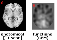
Started To complete this tutorial you will want to brain images. One should be an anatomical image (showing brain structure), while the other should be an SPM (showing brain activity). Matthew's sample data set includes an averaged anatomical scan (avg152) and an SPM (con_0010). for illustration, I will use the single-subject anatomical brain that comes with MRIcro (ch2bet) and Matthew's SPM. The single subject scan will be useful for rendering the surface of the brain. You can view both images on its own by dragging and dropping it onto MRIcro. The anatomical image looks like a brain. The SPM looks like a fuzzy image with dark and bright patches. The dark areas show regions with less activity while the bright areas show regions of more activity. |
 |
| A Simple
Overlay Lets start with by simply overlaying the SPM on top of the anatomical image. First, open the anatomical scan (you may want to adjust the contrast by moving the 'black' and 'white' sliders). Next, choose 'Load image overlay' from the 'Overlay' menu and select the SPM image (e.g. con_0010). Once an overlay is loaded, you can choose the color scheme from the 'Overlay' menu - here I have selected 'ACTC'. The 'Overlay' menu also lets you select whether the overlay is opaque or translucent. Simple overlays are useful for checking to make sure your images are aligned with each other. |
 |
| Showing
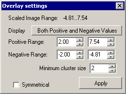
Functional Overlays Now lets make the SPM look like a Statistical Map of activation. Choose 'Load functional overlay...' from the 'Overlay' window. A new window named 'Overlay settings' appears. This allows us to decide which ranges of activity will be displayed.
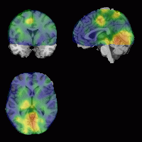
Set the positive range for 3..7.54: positive activity with a value less than 3 will not be shown. Set a negative range of -2.5..-4.81. Finally, press 'Apply' and you will see functional data overlayed - the positive data is shown in hot orange, while the negative data is shown in winter blue. Brighter regions show more statistically significant regions. Note that the display pull-down button allows us to select whether we want to show both positive and negative data, or only show positive data, as illustrated on the figure to the left. We can use the overlay settings window to make all the activity ranges on a series of images the same (e.g. we could show positive F values of 3..6 for a couple data sets), and we can also use the settings to make the positive and negative ranges symmetrical. around zero (e.g. we could set the positive range to 2..4 and the negative range to -2..-4). |

|